

Marka Kimliği
Brand Identity
Marka kimliği bir logo değildir.
Markanın stratejisinin, karakterinin ve vizyonunun görünür ifadesidir.
MONARCH STRATEGY & DESIGN olarak marka kimliğini bir yüzey değil, bir sistem olarak ele alırız.
Her görsel karar; trendler veya dekoratif yaklaşımlar yerine, konumlandırma, anlam ve uzun vadeli tutarlılık üzerine inşa edilir.
Güçlü bir marka kimliği, markanın yalnızca tanınmasını değil; hatırlanmasını, güven oluşturmasını ve tüm temas noktalarında saygı görmesini sağlar.
What We Build
Stratejik düşünceyi net ve rafine bir görsel dile dönüştüren marka kimlikleri tasarlıyoruz.
Çalışmalarımız şu temel prensiplere dayanır:
- Otorite ve netlik iletişimi kurmak
- Zaman ve platformlar boyunca tutarlılığını korumak
- Marka büyüdükçe ölçeklenebilir olmak
- Tesadüfi değil, bilinçli ve amaçlı hissettirmek
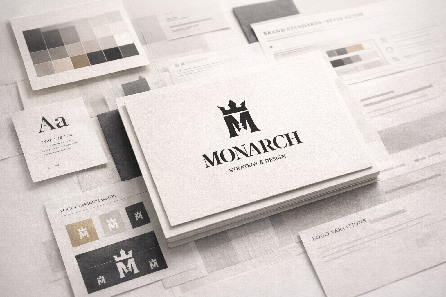
Core Elements of Brand Identity
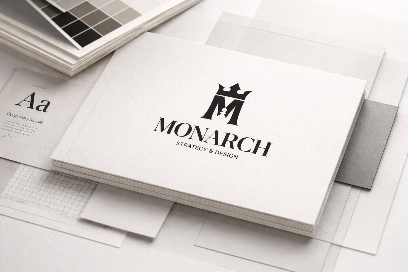
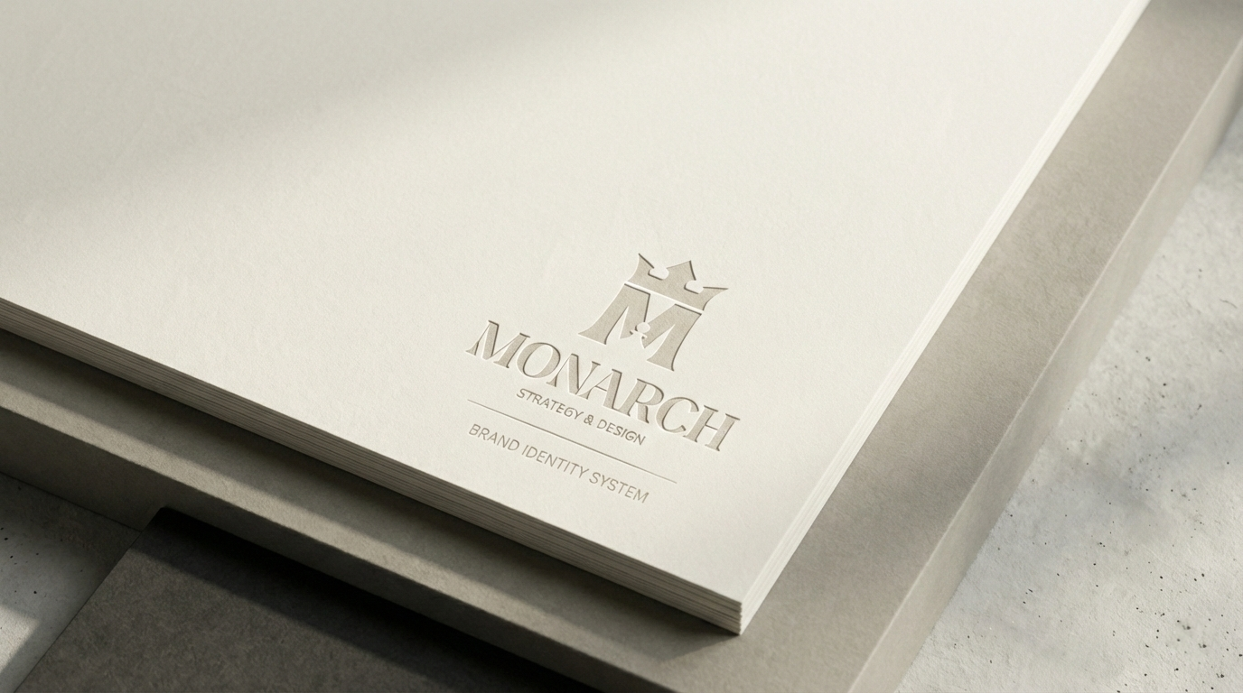
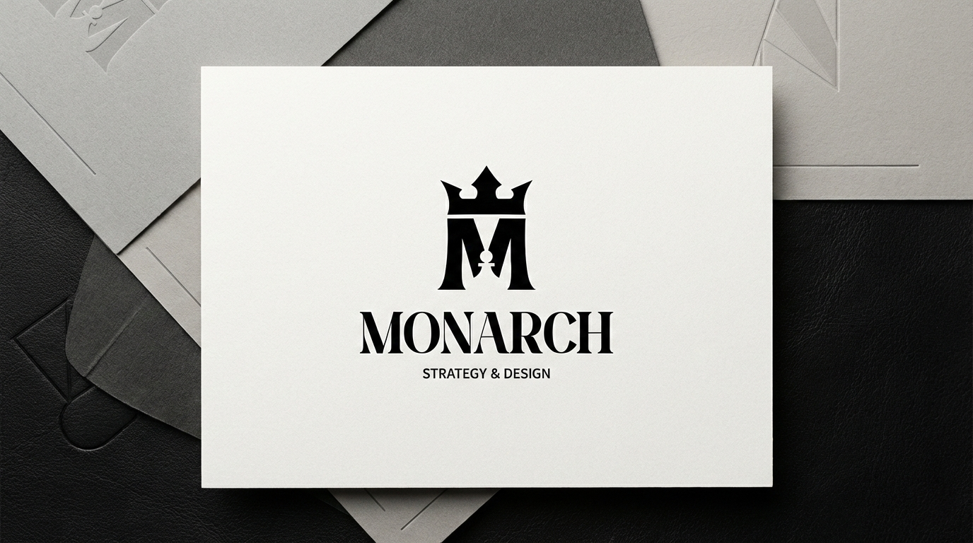
Logo Sistemi
Logo, temel yapı taşıdır; ancak hiçbir zaman tek başına yeterli değildir.
Geliştirdiğimiz yapı:
- Ana ve ikincil logo versiyonları
- Farklı kullanım alanlarına uygun responsive varyasyonlar
- Dijital kullanım için ikon ve sembol sistemleri
Örnek:
Marka iletişiminde kullanılan ana logo, sosyal medya, dijital ürünler ve küçük ölçekli uygulamalar için sadeleştirilmiş sembollerle desteklenir.
Typography System
Typography defines how a brand speaks visually.
We select and design:
- Primary and secondary typefaces
- Hierarchy rules (headlines, body text, captions)
- Usage guidelines for digital and print environments
Example:
A refined serif for authority and positioning, combined with a neutral sans-serif for clarity and usability.
Color Palette
Color is emotional, strategic, and memorable.
We build:
- Primary brand colors
- Supporting and neutral tones
- Contrast and accessibility rules
Example:
A restrained, timeless palette designed to feel premium rather than loud — adaptable for both digital interfaces and editorial layouts.
Graphic Language & Visual System
This is where identity becomes a living system.
We define:
- Grid structures and spacing rules
- Shapes, lines, and modular elements
- Image treatments and visual rhythm
Example:
A consistent use of geometry and spacing that creates recognition even when the logo is not present.
Imagery & Art Direction
Images are chosen, not filled.
We establish:
- Photography and illustration style
- Cropping, lighting, and composition principles
- Mood and tone references
Example:
Minimal, editorial-style visuals that reinforce positioning rather than distract from it.
Why Brand Identity Matters
A well-designed brand identity:
- Builds trust before a word is spoken
- Creates consistency across all brand touchpoints
- Saves time and cost by preventing visual chaos
- Positions the brand clearly in its market
Without a strong identity, even great products appear uncertain.
Our Approach
We do not design identities to impress for a moment.
We design identities to work for years.
Our process is:
- Strategy-led
- System-based
- Detail-oriented
- Focused on long-term brand value
Every element serves a purpose.
Every decision supports positioning.
The Result
A brand identity that feels:
- Clear, not complex
- Refined, not forced
- Premium, not pretentious
- Confident, not loud
An identity that allows the brand to move forward with consistency and authority — across every platform and interaction.